
Overview: Job Hunt is a UI centered strategy RPG centered around a struggling student who battles through the workforce, obtaining corporate skills before facing off against their employers in dialogue-based combat
Role: UX/UI Designer, Game Designer, Asset Artist
Toolkit: Figma, Photoshop, Unity, Miro, Milanote
UX Research
Background
Our concept started with a loose game sketch, a semi-retro-comedy game poking fun at the job search process that post grads experience. Platform laptop and PC, designed to be both turn based and time sensitive
- time sensitive combat with recharge on actions
- clear communication of battle states (prone, attacking, damaged etc.)
- clear communication of effects and uses of skills
*Since early stage, the idea was to create an interface that compliments a game centered around player strategy, that appeals to both fans of longer term strategy and fast paced combat with immedate rewards
Research Goals
blah blah
Methodologies
- comparative analysis
- player motivation/affinity mapping
- player personas
- persona scenarios
Comparative Analysis


Adventures with Anxiety
Omori
Fire Emblem 3
| AwA | Omori | Fire Emblem | |
|---|---|---|---|
| Summary | choice based interactive fiction | narrative turn based RPG | tactical fantasy RPG |
| Target Audience | young casual mobile players (30 min play) | young fans of narrative indie games | older gameboy players, strategy lovers |
| Strengths | punchy and consise dialogue, well tutorialized game loop | clear communication of battle states and tools while maintaining campy visual flare | well established and tested precedent for stat management |
| Weaknesses | no long term decision making or way to view past decisions, ideal for linear play | specifics of synergies are hard to memorize (angry > happy, happy > sad) | unfriendly for beginners lots of visual information all at once |
Player Motivation

UI should compliment a game built around mastery and achievement while also blending into the background during faster paced gameplay and narrative elements
Persona #1

Gemma Risch
22 y/o, unemployed/part-timer, casual user
Frequently Played


Bio
Between working part time, college and job hunting on linkedIn or Hanshake Gemma enjoys casual fun gaming with quick rewards and a relatively low time commitment. Gemma enjoys games like Valorant for its variety of preset character builds colorful flashy gameplay and Hades for its short term decision making and rich story
Player Motivation
- Excitement (Action): Gemma enjoys fast paced, exciting games that have flashy visuals and rapid speed combat.
- Story (Creativity): Gemma picks up games that have unique stories and concepts. She especially loves games that incorporate humorous & nonsensical elements into gameplay.
Frustrations With Existing Games
- Gemma finds having to grind to progress in games monotonous and time consuming
- Gemma struggles when she’s forced to play with a particular strategy to be able to progress (ex level up grind, poorly balanced abilities, only playing defensively etc)
Needs and Expectations for New Games
- a light hearted playful narrative
- a forgiving grading system allowing for experimentation in strategy
Player Experience Goals
- Gemma should find the strategic elements of the game easy to grasp but should be able to progress narrative without much long term strategizing
- Leveling up should still be visually satisfying to Gemma and goals should feel difficult but within reach
- Narrative should be conveyed through both writing and visuals in a way that doesnt intrude on gameplay
Persona #1 Scenario
Gemma has made it to the first boss battle but she is overwhelmed by the amount of different skills and items available to use. She does feel motivated to plan very far in advance before battles. Gemma might lose a couple times except:
- She might gain XP with each loss, allowing her to brute force a boss
- Other gameplay/bosses might be available even if she’s stuck a section of the map
- No progress is lost by losing a battle, and loss can be worked into the narrative
Persona #2

Jerome Evans
25 y/o, business major, experienced user
Frequently Played


Bio
After a long day at work Jerome likes to unwind with immersive games where he can experiment with different builds, and optimize for min-max gameplay. Jerome enjoys games like Skyrim for its diverse long term build options and Genshin for its synergy and stat effect interactions.
Player Motivation
- Completion (Achievement): likes to unlock all available abilities to guaruntee a win
- Design (Creativity):
- Strategy (Mastery):
Frustrations With Existing Games
- Jerome dislikes being locked into a specific way of play; static gameplay
- After getting the basics Jerome doesn’t want hints or player guidelines, he prefers to learn through experimentation
Needs and Expectations for New Games
- Character Optimization – being able to craft a powerful “build” with synergies
- Optional collectables for side quests
- Rewards for completing a task perfectly, allowing for speedruns and hitless runs
Player Experience Goals
- Jerome should have ample time to collect and experiment with effects, builds and items
- Jerome is able to quickly grasp how to use abilities
- UI and other flare should make it easier to compare stats rather than overwhelm with visual information
Persona #2 Scenario
When Jerome discovers that he can complete optional tasks to unlock new skills, he does so at every opportunity, though gets a little annoyed at having to repetitively fight in order to gather more skills. As he gains more skills though, he spends time finding what synergizes well together to create an optimized arrangement, making side quests more efficient
- In game ‘test dummy’ to test stat effects & combos that’s integrated into the narrative (mock interview)
- An ‘elemental’ system to make it clear which combinations build on each other and which don’t so he can make informed decisions about where he prioritizes his energy
UX Design
Project Goals
—
Features roadmap
After a first draft gameplay design, I realised I had to reduce to just as enough features to demonstrate our concept. In the final version I’ve included basic features such as the Battle Loadout Screen, and Battle screen while continuing to develop our Open World Level Select screen and fleshing out the actions taken during battle with visual responses to indicate change.
Information Architecture
User Flow
We started with two primary flows:
• ability selecting – battle loadout scene
• battle screen
The idea was that the bulk of decision making needs to be made in the battle loadout screen, and that most active gameplay happens in the battle screen
*Ideally we would have explored deeper architecture including earning new skills but given the time constraint and simultaneously developing the game we went with the main two screens.
Overall Game User Flow

Information Flow

Task Flows
—-
Wireframes
For the first flow, I’ve developed our battle loadout scene, which I’ve divided in two main steps: General loadout and Edit mode under which I added another sketch to show how the General loadout would adapt to a changed selection


UI Design
Going off an initial moodboard we were conflited between the bright blue and clean aesthetics of the Linkedin, Handshake and social media that our game was intended to parody and the low-poly retro style of our models.

Going forward, distinguishing the two styles in order to draw separation between player actions and non-interactable elements became an asset, not a drawback
Instead we developed two distinct style-guides depending on if the UI was diagetic or virtual in the game world, referenced in an ongoing style guide.
UI Library Components
Physical Pallette
Digital Pallette


- harsh edges and organic shapes
- warm tones
- overlaid textures
- rounded corners
- analogus colors
- cool tones
Certain elements I designed to work work between both interfaces, since the Physical Pallette is usually going to be overlaid over the Digital Pallette like the selected color.


soft skills

work experience

education
- our high fidelity key screens are still in progress
Usability Tests
Prototype
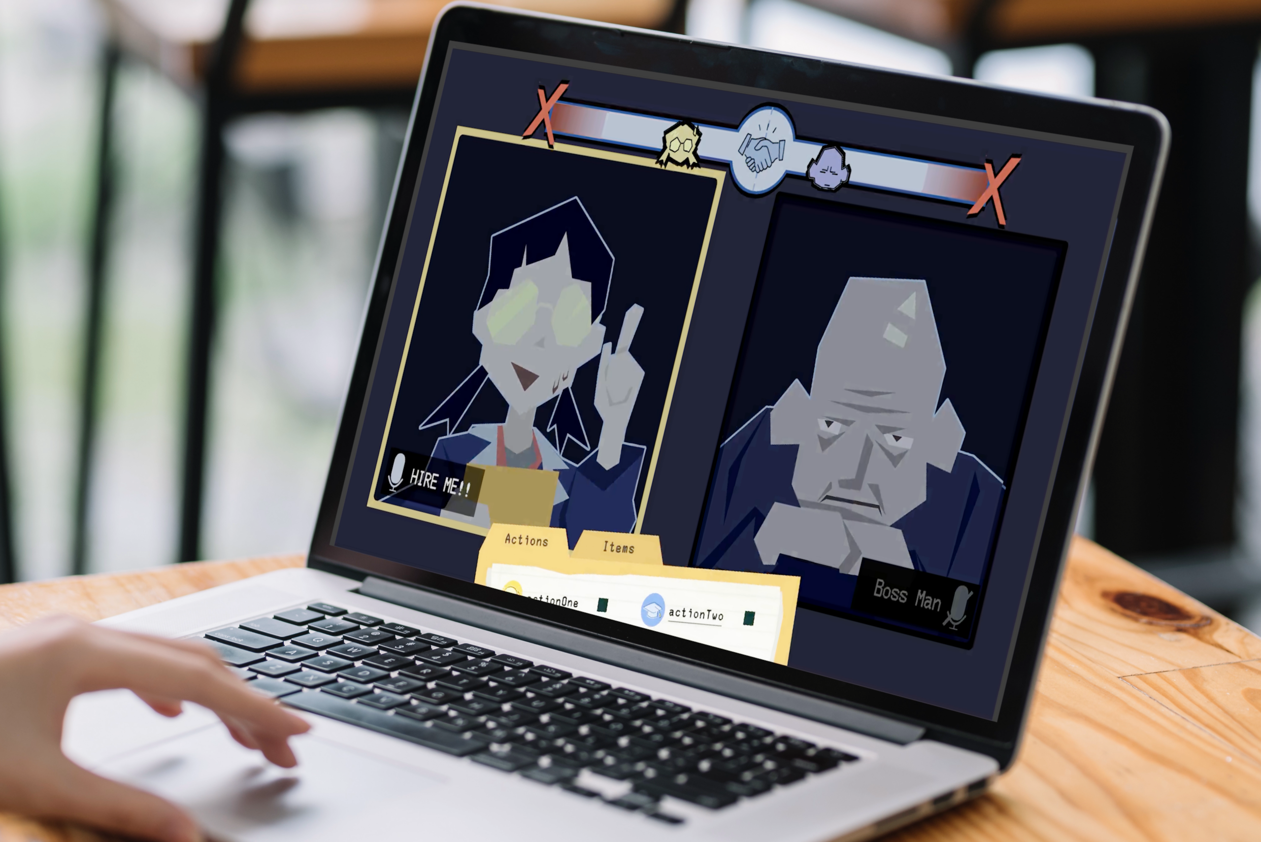
To get to our first prototype we experimented with layouts in Miro individually followed by a design critique. Eventually we reduced available actions to what we knew would be implemented into gameplay, given all the time-sensitive decision making the player would need to do.


Our interactable prototype was more of a parody of a fighting game which would be easy to understand for our demographics, leaving more visual space for status effects

Outcome
After playtesting with 3 graphic designers and non-designers we got some general feedback:
What Worked:
- zoom visual reference
- clean and not overwhelming
- contrast between paper UI and digital UI
- otomated action pop up on your turn
Need to Improve
- healthbar was hard to interpret, unsure whether it was ticking down or up
- actions folder blocked the screen
- mute icons felt like they were clickable buttons rather than indicating cooldown
Questions:
- can I pause during combat?
- what happens when I reach the middle?
Ideas:
- change the HP logo to indicate reaching it is bad
- get rid of the square outline on the mute icons
- lower the height of the actions folder
Iterations
My focus at this phase of feedback was redesigning our healthbar and ultimately changing the grading and synergy system as a result.
While I started with a simple icon redesign there was a deeper problem with the Adjoining healthbar –

After discussion, we wanted to convey the idea that meeting in the middle is good. Like in a real interview coming on too strong or too softly is a no-no.

Friday Night Funkin Healthbar – push your enemy to their side on the left


In this new version doing too much rapid damage to your enemy pulls yourself towards the center, while taking damage pushes you to the left, the idea is for the player to strike a balance between dealing and taking damage and meet your opponent in the middle
Now the ‘danger’ indicators are on each far end, with subtle danger zones that dynamically affect the character icons.
I also designed and added our pause menu to reflect the fact that our gameplay is time sensitive as well as integrate our accessibility settings


Key Takeaways
- challenges
- lessons learned